Blog Contents
Last Updated on 5 months ago by
Thank you for reading this post, don't forget to subscribe!A wedding day should feel beautifully personal and thoughtfully designed. With so many trends that shift from season to season, many couples wonder how to choose wedding colors that will still feel elegant and meaningful years from now.
Timeless wedding color palettes provide that confidence. These palettes rely on harmony, balance, and intentional choices rather than trends that fade quickly.
At a historic venue like JH Adams Inn, classic colors create even more impact. The warm wood details, rich textures, and sophisticated architecture offer a natural canvas for elegant shades that elevate the atmosphere rather than overwhelm it.
A timeless palette does more than look beautiful. It enhances the setting and creates a cohesive, welcoming experience for guests.
Classic Combinations We Love
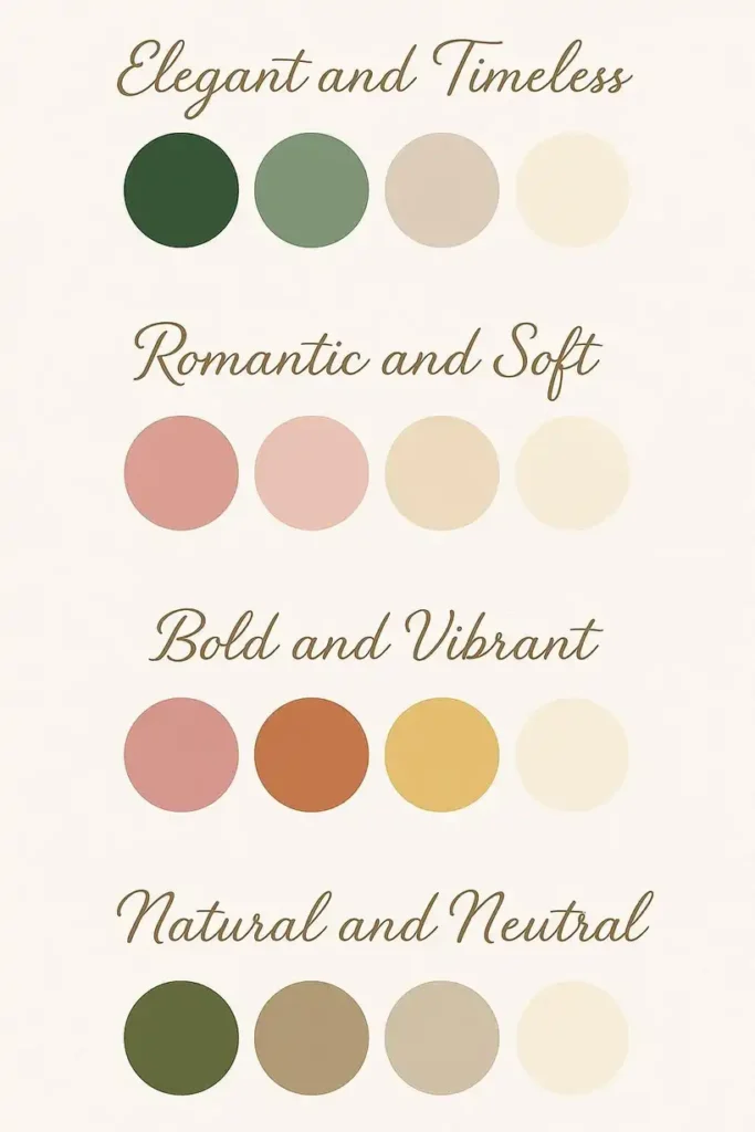
Some color pairings feel refined no matter how styles evolve. Ivory and sage is one of the most enduring combinations and blends gracefully with the warm interior tones of JH Adams Inn.
Light greenery paired with ivory florals and linens creates a soft, romantic look that appeals to couples who prefer neutral wedding palettes with a gentle organic touch.
For those who love richer tones, navy and gold brings depth and formality without feeling heavy. The contrast feels polished and elevated, especially in a historic wedding venue.
Navy and ivory wedding palettes become even more sophisticated when accented with gold details on flatware, chargers, candleholders, or table signage.
Blush and champagne is another palette that never loses its charm. It blends softness with sophistication and photographs with a warm, luminous quality.
Couples who enjoy blush and gold wedding ideas can mix champagne linens, blush florals, rose gold accents, and warm candlelight for an atmosphere that feels romantic and inviting.
Neutrals with a Twist: Adding Depth with Texture and Accents
Neutral palettes are often associated with simplicity, yet they can be incredibly rich when layered well. Texture becomes a powerful tool when working with monochromatic or muted color schemes.
Subtle patterned linens, velvet ribbons, matte ceramic vases, or stone decor add interest without straying from a cohesive palette.
Taupe linens paired with cream florals, cappuccino-colored candles, and soft gold touches create a warm and inviting foundation.
You can introduce a single accent color, such as dusty mauve or muted sage, to add depth without shifting away from a timeless neutral palette.
The most important element when working with neutrals is variation. Keeping all tones too similar can make the design feel flat.
Layered textures and slight shifts in shade ensure the final look feels polished and thoughtfully planned.
How to Make Traditional Colors Feel Fresh
Traditional wedding colors remain favorites for a reason, but they can feel even more modern with the right approach.
A black and white wedding palette, for example, becomes contemporary when mixed with bold contrasts or unexpected materials.
Tall white floral arrangements, sleek black taper candles, or glossy accent pieces can transform a familiar palette into something striking and sophisticated.
Emerald and gold is another classic pairing that feels luxurious. Instead of using emerald everywhere, consider placing it in velvet linens, glassware, or delicate stationery accents.
Gold can appear in understated ways, such as flatware, frames, or votives, to create a beautifully layered look without overwhelming the space.
Updating classic palettes with modern elements allows couples to enjoy the familiarity of traditional colors while still expressing a fresh, current style.
Matching Your Palette to the Venue’s Architecture and Atmosphere
JH Adams Inn offers a rich and welcoming backdrop for elegant weddings. Its wood paneling, classic furnishings, and warm interior lighting make it especially important to consider how your palette interacts with the space.
Warm neutrals like ivory, champagne, and soft gold complement the Inn’s architectural features. Light greens and sage tones add a natural, refreshing contrast while remaining cohesive with the venue’s overall tone.
Jewel tones such as navy or emerald offer dramatic contrast without competing with the existing design elements.
Lighting plays a significant role in color selection. The Inn’s warm lighting enhances earthy tones and softens pastel shades, helping colors appear richer and more inviting.
When your palette aligns with the venue, everything feels intentional and beautifully coordinated.
Floral, Linen, and Lighting Tips to Tie It All Together
Your chosen colors become more dynamic through florals, linens, and lighting. These elements are the most effective ways to bring a palette to life without overwhelming the design.
Florals
Select florals that support the palette rather than match it exactly. Ivory and sage palettes pair well with soft greenery.
Navy and gold palettes shine with white florals accented by dark blue touches. Blush and champagne palettes benefit from varied blush tones for dimension and softness.
Linens
Linens set the foundation for your reception space. Champagne linens with ivory runners create an elegant, understated look.
Textured linens in soft pastels bring depth to muted schemes, while navy velvet linens on key tables make a dramatic and sophisticated statement.
Lighting
Lighting influences how every color appears. Warm candlelight enhances nearly all timeless palettes, adding softness and romance.
Amber or gold uplighting complements the Inn’s interiors and enriches warm tones. When using greens or blush shades, warm lighting keeps the palette cohesive and inviting.
When florals, linens, and lighting all communicate the same vision, your palette feels intentional and beautifully unified.
Final Thoughts
Timeless design thrives on balance, intention, and a sense of place. Choosing a color palette that works with your venue, reflects your personal style, and supports the atmosphere you envision allows your wedding to feel elegant for years to come.
Whether you prefer soft neutrals, bold jewel tones, or classic color combinations, the goal is to create harmony that enhances both your celebration and your memories.
FAQ’s
1) What are timeless wedding color palettes?
Timeless wedding color palettes are balanced, harmonious color pairings that look elegant across years of photos. They rely on classic neutrals, refined contrasts, and intentional accents rather than short-lived trends.
2) How to choose wedding color palettes for a historic venue?
Start with the venue’s built-in tones (wood, stone, warm lighting) and choose colors that complement—not compete. Classic neutrals, soft greens, and jewel tones typically elevate historic architecture while staying cohesive.
3) Why is ivory and sage a timeless wedding palette?
Ivory and sage stays timeless because it’s soft, natural, and universally flattering in warm interiors. It pairs clean linens and ivory florals with gentle greenery for a romantic, refined look.
4) How to make neutral wedding color palettes look rich (not flat)?
Layer texture and tonal variation—patterned linens, velvet ribbon, matte ceramics, candles, and subtle shade shifts. A single muted accent (dusty mauve or sage) adds depth without breaking the neutral feel.
5) How to make traditional wedding colors feel modern?
Keep the classic palette, but update the materials—sleek tapers, glossy accents, cleaner lines, or bold contrast. For emerald and gold, use emerald in small luxury touches (velvet, glassware) and keep gold understated.
6) How do florals, linens, and lighting tie a wedding palette together?
Florals should support the palette (not match perfectly), linens set the foundation, and lighting controls how colors read in the room. Warm candlelight and gold/amber accents generally enhance timeless palettes and keep them inviting.